The Anatomy of a High-Converting Product Page for Egyptian Shoppers
Every block on a product page should earn its place by removing one doubt that stops a shopper from buying. On Muhra, the modest fashion brand I run in Egypt, I rebuilt the product page around that rule: each section answers a specific question an Egyptian woman asks before she orders a piece of clothing she can’t touch.
In this guide I take the page apart block by block: what each one does, the consumer behaviour behind it, what the research says, and which part of ROI it moves. At the end I show how I build and audit the whole thing with Claude Code, Anthropic’s AI coding agent, working directly on the Shopify theme and product data.
Revenue from a product page comes down to three levers:
- Conversion rate: how many visitors decide to order
- Average order value: how much each order is worth
- Kept-order rate: how many orders are actually delivered, paid for and not returned
In a cash-on-delivery market, that third lever is the one most stores forget. An order the customer refuses at the door costs you twice: shipping out and shipping back.
Who you’re designing for: the Egyptian online fashion shopper
Best practices written for US or European stores miss what makes Egypt different. Four behaviours shape every block on the page.
1. She wants to pay when the product is in her hands. A Google and Bain & Company study found that about 85% of Egyptian online shoppers prefer cash on delivery, against 62% across MENA. The top reason given was wanting to pay “once they have the product in hand”. Amazon Payment Services still put COD at around half of Egypt’s payments landscape in 2023, with only 3% of Egyptians holding a credit card. The same Google and Bain study warns that COD “leads to higher return rates and failed deliveries”.
What this means for the page: trust signals about payment, delivery and inspection aren’t decoration. They’re the checkout.
2. She shops on her phone, and she found you on social media. PwC’s 2024 Voice of the Consumer survey found that 46% of Egyptian consumers shop online weekly on their phones, against 34% globally. Over 80% have discovered brands through social media, and 90% say social media ads influence what they buy.
What this means for the page: she lands from an Instagram or Facebook ad, on a phone, ready to decide in seconds. The page has to work in a thumb’s reach and load fast.
3. She checks what other women say first. In the same PwC survey, 90% of Egyptian consumers said they seek out reviews before buying.
What this means for the page: reviews, and photo and video reviews in particular, belong on the product page, not hidden on a separate page.
4. She’s watching value closely. 67% of Egyptians named inflation as their top concern, and 32% said they would switch brands for better value (PwC, 2024).
What this means for the page: value framing like bundles, “buy two” offers and free-shipping thresholds lands harder here than price cuts on single items.
The anatomy of the page
Here’s the Muhra product page on a phone, from top to bottom, with the doubt each block answers and the lever it moves.
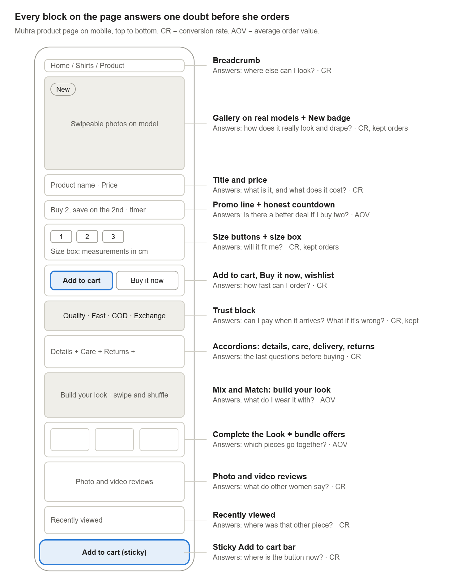
The order matters. The doubts she has first (how does it look, will it fit, how do I pay) are answered before she has to scroll far. The blocks that grow the order (Mix & Match, bundles) come after she has already decided to buy.
Block by block: what each section does and why
1. Gallery on real models, with a “New” badge
What it is: Swipeable full-screen images of each piece worn by a model, front, back and detail, with an automatic “New” badge on recent arrivals.
The behaviour: She can’t touch the fabric, so the photos have to do it for her: drape, length, how opaque the fabric is, and how modest the fit is when she moves.
The evidence: Baymard Institute’s apparel testing found that flat “cut-out” images weren’t enough for shoppers to judge fit and drape, and that they reacted badly to mannequins. 21% of apparel sites still fail to show products on human models.
ROI lever: Conversion rate first, then kept orders. A buyer who has seen exactly how it hangs is less likely to refuse it at the door.
2. Promo line with an honest countdown
What it is: One line under the price: buy any two pieces and get a discount on the second, with the code applied automatically and a countdown to when the offer ends.
The behaviour: With inflation the top concern, value framing works better than a cut on one item. “Buy two” gives her a reason to add a second piece now instead of saving it for later.
The evidence: Baymard’s checkout research found that unexpected extra costs are the most common reason shoppers abandon (40% of those who abandoned). Showing the offer on the product page, and applying it automatically, means the price she expects is the price she pays.
ROI lever: Average order value. One rule: the countdown must be real. Fake timers that reset on refresh damage trust, and trust is the whole game in a COD market.
3. Size buttons and a size box with measurements
What it is: Sizes shown as tappable buttons, not a dropdown. A size box underneath shows garment measurements in cm, with the note that measurements are taken flat and to size up if she’s between sizes.
The behaviour: Fit is the biggest doubt in online fashion, and with modest wear she’s also judging length and looseness.
The evidence: Baymard found 83% of desktop and 87% of mobile apparel sites don’t give enough sizing information. Sizing uncertainty was a common reason testers abandoned a product. 70% of sites hide sizes in a dropdown, and testers often missed the size selector entirely. Coresight Research found size and fit is the top reason for online apparel returns, cited by 53% of retailers.
ROI lever: Conversion rate and kept orders together. This is the highest-value block on the page for a fashion brand.
4. Add to cart, Buy it now, and a sticky bar on mobile
What it is: A primary Add to cart button, a Buy it now button that skips the cart, a wishlist heart, and a sticky Add to cart bar that follows her as she scrolls.
The behaviour: She scrolls through photos, sizes and reviews, and the decision happens somewhere in the middle. The button has to be there when she decides, not back at the top.
The evidence: Deloitte’s study for Google found that a 0.1-second improvement in mobile speed lifted retail conversions by 8.4%. Small reductions in friction on mobile add up, and removing the scroll back to the top is the same kind of saving.
ROI lever: Conversion rate. The wishlist captures intent from shoppers who aren’t ready yet, for retargeting later.
5. The trust block: payment, delivery, inspection, exchange
What it is: Four short lines with icons directly under the buttons: premium fabrics, delivery in a few working days across Egypt, pay on delivery with only shipping paid upfront, and an exchange window. The store-wide trust bar adds inspection on arrival.
The behaviour: This block answers the four questions an Egyptian COD buyer asks before ordering: Is it good quality? When will it come? Do I have to pay before I see it? What if it doesn’t fit?
The evidence: Google and Bain found the main reason for choosing COD is wanting to pay once the product is in hand. Baymard found 20% of shoppers abandon because delivery is too slow and 19% because they don’t trust the site with card details.
ROI lever: All three. It lifts conversion by answering doubts, and the prepaid shipping fee filters out casual orders that would be refused at the door. Paying something upfront is a small commitment that makes a refusal less likely. In a COD market, that’s often the biggest single gain in kept orders.
6. Accordions: details, care, delivery, returns
What it is: Collapsible sections for fabric and details, care instructions, delivery terms and the returns policy, with links to the full policy pages.
The behaviour: Most shoppers won’t read them, but the ones close to buying will. Folding them keeps the page short on mobile without hiding the answers.
The evidence: Baymard’s testing shows shoppers who leave the product page to look for missing information often don’t come back.
ROI lever: Conversion rate, and fewer customer-service messages asking the same questions on WhatsApp and Instagram.
7. Mix & Match, Complete the Look, and bundles
What it is: A “Build Your Look” section where she can swipe through matching pieces, shuffle the outfit and add the whole look to her bag in one tap. Below it, “Complete the Look” shows three pieces chosen for that product, with bundle offers alongside.
The behaviour: Modest dressing is about the full outfit, the layering and the coordination, not single items. She’s already imagining what she’d wear it with.
The evidence: This is classic cross-selling. The “buy two” discount from block 2 makes the second piece feel like the smart choice rather than an extra cost.
ROI lever: Average order value. A two-piece order also spreads the fixed delivery cost over more revenue, which matters even more under COD.
8. Photo and video reviews
What it is: A reviews widget with a carousel of customer photo and video reviews.
The behaviour: She trusts other women wearing the piece more than the brand’s own photos, especially for fit and true colour.
The evidence: Northwestern University’s Spiegel Research Center found a product with five reviews is 270% more likely to be bought than one with none, rising to 380% for higher-priced products. The first five reviews matter most. Purchase likelihood peaks at an average rating of 4.2 to 4.5 stars, not 5.0, and verified-buyer badges improved the odds of purchase by 15%.
ROI lever: Conversion rate, and the effect is biggest on premium pieces.
9. Breadcrumb and Recently viewed
What it is: A breadcrumb trail at the top and a Recently viewed carousel at the bottom.
The behaviour: Fashion shoppers compare. She opens three pieces, then wants to go back to the second one.
ROI lever: Conversion rate across the session. It keeps a “not this one” from turning into “not this store”.
10. The invisible block: speed and language
What it is: Fast interaction on mobile, and copy that speaks her language.
The behaviour: Every block above depends on the page responding instantly and reading naturally.
The evidence: Every 0.1 seconds of mobile speed counts (Deloitte for Google). CSA Research found 76% of online shoppers prefer to buy products with information in their own language, and 40% won’t buy from sites in another language.
ROI lever: Conversion rate on every other block. A slow page or unfamiliar language weakens everything above it.
How the blocks add up to ROI
The three levers multiply, so a modest gain on each compounds into a large gain overall. Improve conversion, order value and kept orders by 10% each, and net revenue per visitor rises by about a third (1.1 × 1.1 × 1.1 ≈ 1.33), with the same ad budget.
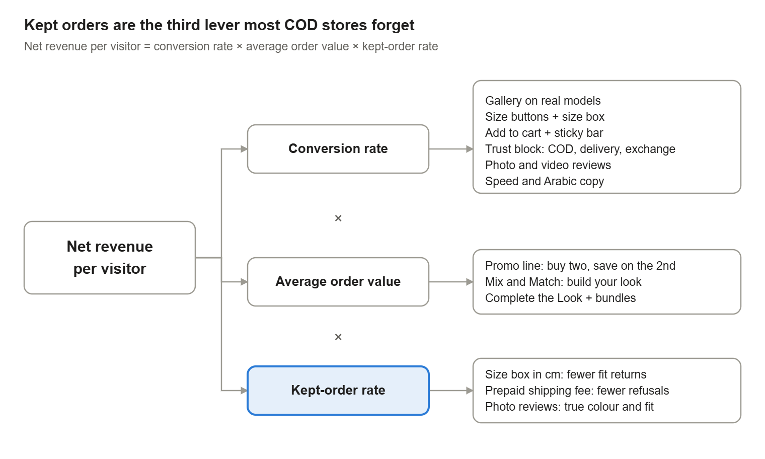
This is why I don’t judge a block by conversion rate alone. The size box and the prepaid shipping fee can look neutral on conversion while quietly cutting refusals and returns, which is often where a COD store’s margin goes.
How I build and audit it with Claude Code
The core blocks are custom Shopify theme sections, not page-builder widgets, with the reviews and bundles coming from apps. Claude Code builds and edits the sections, wired to product metafields so each product controls its own size table, care text and matching pieces. Here’s the workflow.
1. Connect it to the store. Create a custom app in Shopify admin with access to products, themes and analytics, and give Claude Code the Admin API token through an environment variable. Install the Shopify CLI so it can pull the theme and run a live preview.
2. Map what’s already there. Claude Code reads the theme’s product template JSON and lists every section and block, what’s switched on or off, and which app blocks are loaded.
Read the live theme’s product templates. List every section and block in order, flag anything disabled, and tell me which products use which template.
3. Audit every product against the blocks. A block is only as good as the data behind it. A size box with no measurements is worse than no size box.
For every active product, check that the size table, care text, model photos, matching pieces and alt text are filled in. Output a table of what’s missing, sorted by sales so the products that earn the most get fixed first.
4. Build or change blocks on a duplicate theme. Claude Code writes the Liquid, CSS and settings schema, so the team can edit the text from the theme editor without code.
On a duplicate of the live theme, add a trust block under the buy buttons with four editable items: title and one line each. Make it RTL-safe for Arabic, match the existing typography, and give me a preview link.
5. Approve before anything goes live. Claude Code shows a diff of every file and product it changes, and backs up the originals first. Nothing reaches customers until I’ve checked it on my own phone.
6. Check speed after every change. Every app and section adds JavaScript. Claude Code can list what loads on the product template and how long each script blocks the main thread, so a new block doesn’t quietly slow down everything else.
Measuring it
Take a baseline before you change anything, then change one block at a time so you know what moved the number. For each change, Claude Code pulls the same report at 14 and 30 days.
| Lever | Metric to watch | Blocks that move it |
|---|---|---|
| Conversion rate | Add-to-cart rate and checkout completion per product | Gallery, size box, sticky button, trust block, reviews |
| Average order value | Items per order, share of orders using the bundle offer | Promo line, Mix & Match, Complete the Look |
| Kept orders | Refused deliveries and returns as a share of orders | Size box, trust block, prepaid shipping, photo reviews |
| All three | Net revenue per visitor | The whole page |
Net revenue per visitor is the number I use to decide. A change that lifts conversion but brings in more refusals isn’t a win.
The takeaway
A high-converting product page in Egypt isn’t a longer page. It’s one where every block answers a real doubt: Will it fit? What does it really look like? Can I pay when it arrives? What if it’s wrong? Will it go with what I own?
Answer those, and you get more orders, bigger orders, and orders that stay sold. Claude Code turns that from a design brief into a working theme in days instead of weeks, but it’s the logic that does the selling.
Want this built for your store?
Turn your product page into your best salesperson
In the Store Growth Audit I go through your product pages, ads and numbers and show you which blocks to fix first. In the mentorship I teach you to build and test them yourself.
Sources: Google and Bain & Company, E-commerce in MENA: Opportunity beyond the hype (2019); Amazon Payment Services, A Spotlight on Egypt’s Payments Landscape (2023); PwC Middle East, Voice of the Consumer 2024: Egypt findings; Baymard Institute, Apparel size information and 5 apparel best practices; Baymard cart abandonment research via Red Stag Fulfillment; Coresight Research, The True Cost of Apparel Returns (2023); Spiegel Research Center, How Online Reviews Influence Sales (2017); Deloitte for Google, Milliseconds Make Millions (2020); CSA Research, Can’t Read, Won’t Buy (2020).